Overview
The Themes tab in the right panel gives you full control over the visual appearance of your document. From colorus and fonts to cards, content blocks, buttons, images, and page backgrounds — every visual element can be customized to match your brand or suit the purpose of a specific document.
Accessing the Theme Editor
Open any document in the editor
Click the Themes icon on the right panel
The Themes panel will open with all customization options
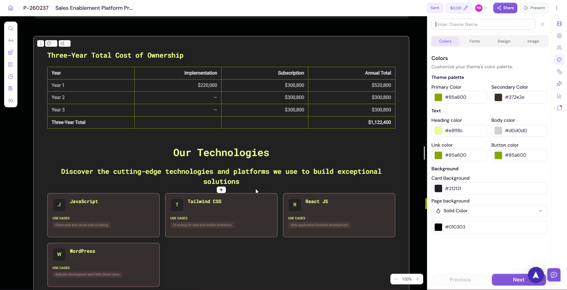
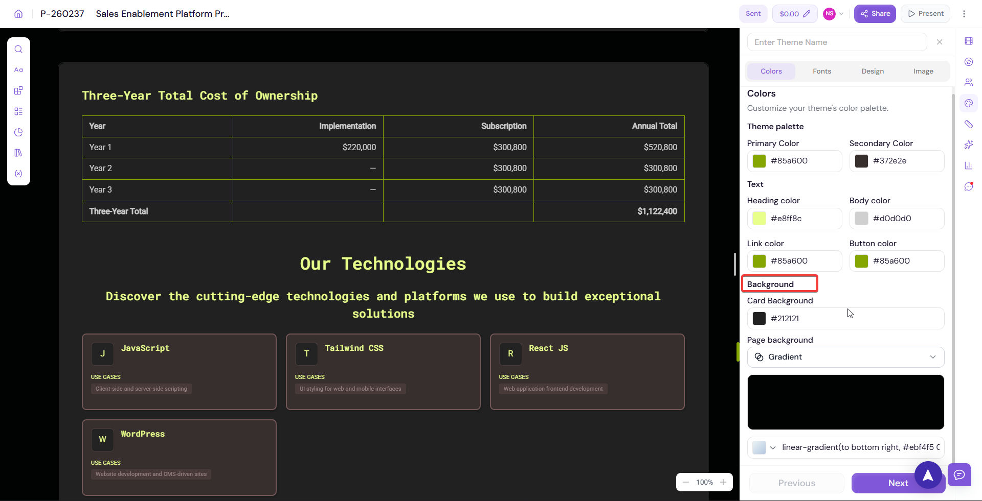
Colours
Customize the colour palette applied across your document.
Click on Colours in the Themes panel
Adjust your primary, secondary, accent, and background colours
Enter a specific colour using HEX, RGB, or HSL values, or use the colour picker
-
Changes are applied to the document in real time

💡 Pro Tip Use your brand colours consistently across all documents. If you set up your branding during onboarding, your brand colours will already be available as your Org Theme — select it to apply everything in one click.
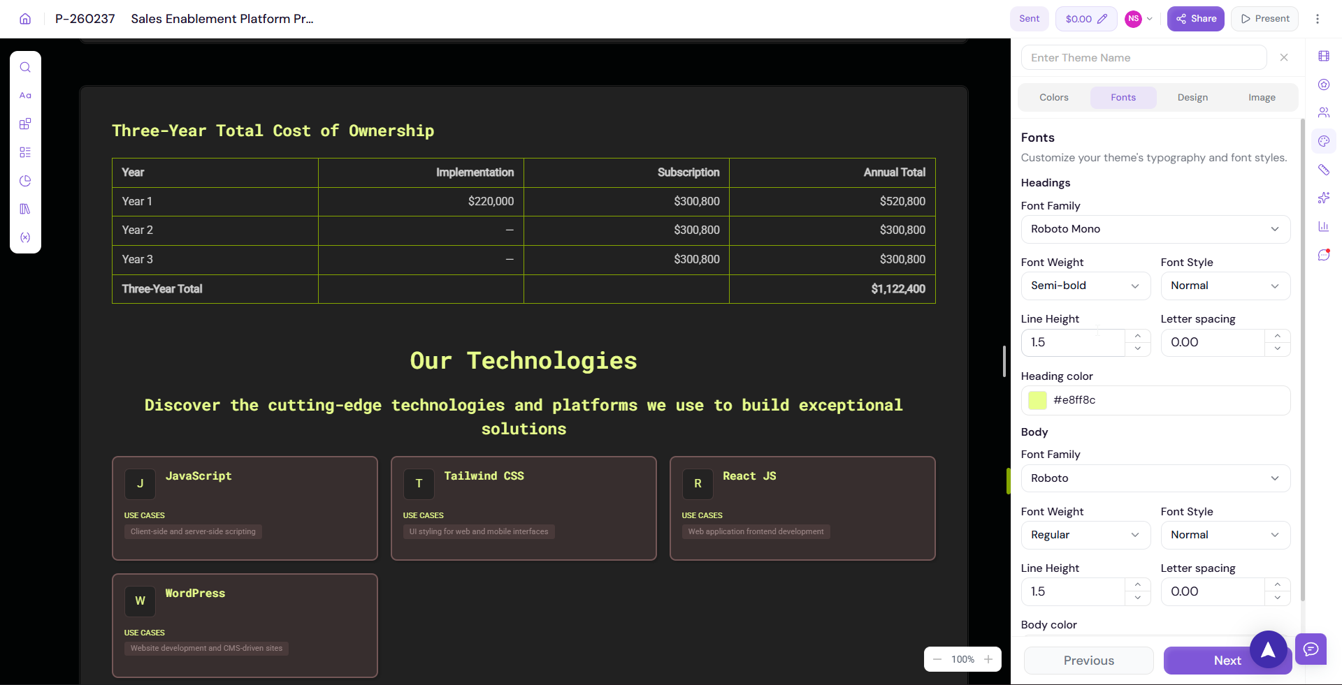
Fonts
Customize the typography used across your document.
Click on Fonts in the Themes panel
Select your preferred Heading Font from the dropdown
Select your preferred Body Font from the dropdown
Adjust font sizes and weights if available
-
Preview the changes on the canvas in real time
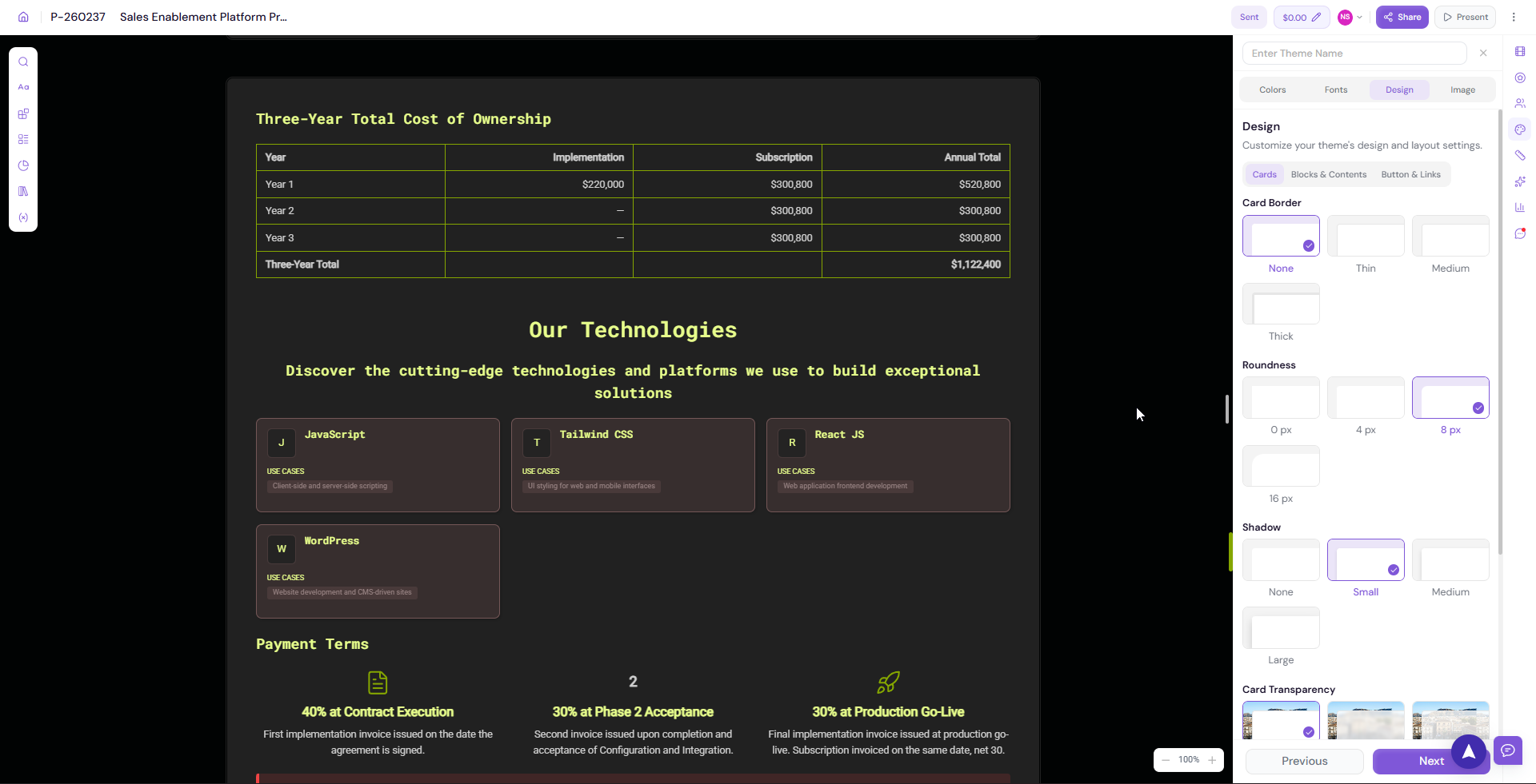
Cards
Customize the design of card elements used in your document — such as pricing cards, feature cards, and team member cards.
Click on Design → Cards in the Themes panel
-
Adjust card styles including:
Border radius
Border colour
Shadow
Background colour
Padding
-
Preview the changes on the canvas in real time
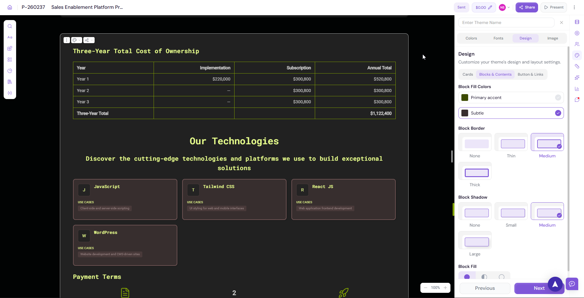
Blocks & Contents
Customize how content blocks are styled across your document.
Click on Design → Blocks & Contents in the Themes panel
-
Adjust block styles including:
Background colour
Border settings
Spacing and padding
Content alignment
-
Preview the changes on the canvas in real time
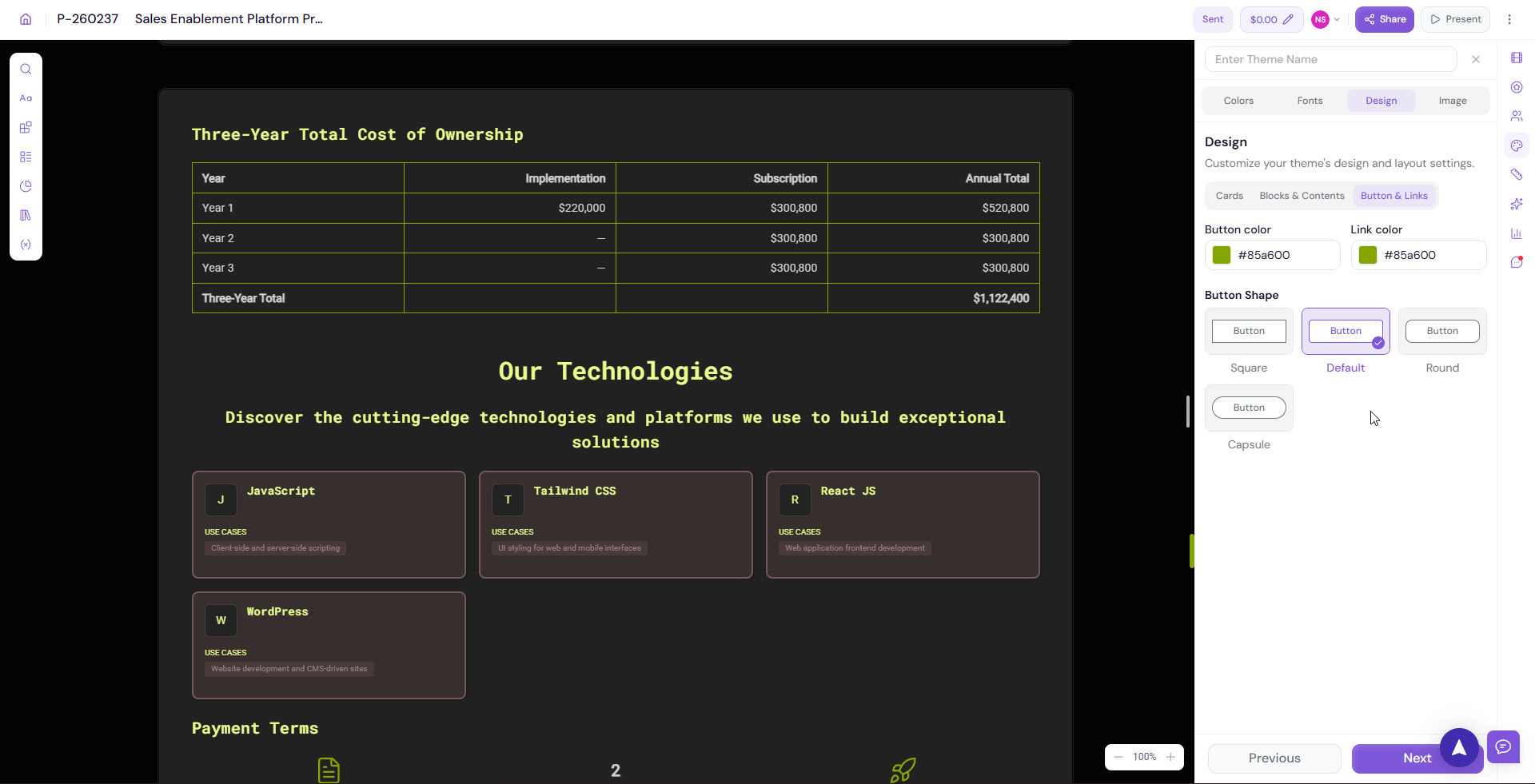
Buttons & Links
Customize the appearance of all buttons and links in your document.
Click on Design → Buttons & Links in the Themes panel
-
Adjust button styles including:
Button colour
Text colour
Border radius
Hover state
-
Adjust link styles including:
Link colour
Underline behaviour
-
Preview the changes on the canvas in real time
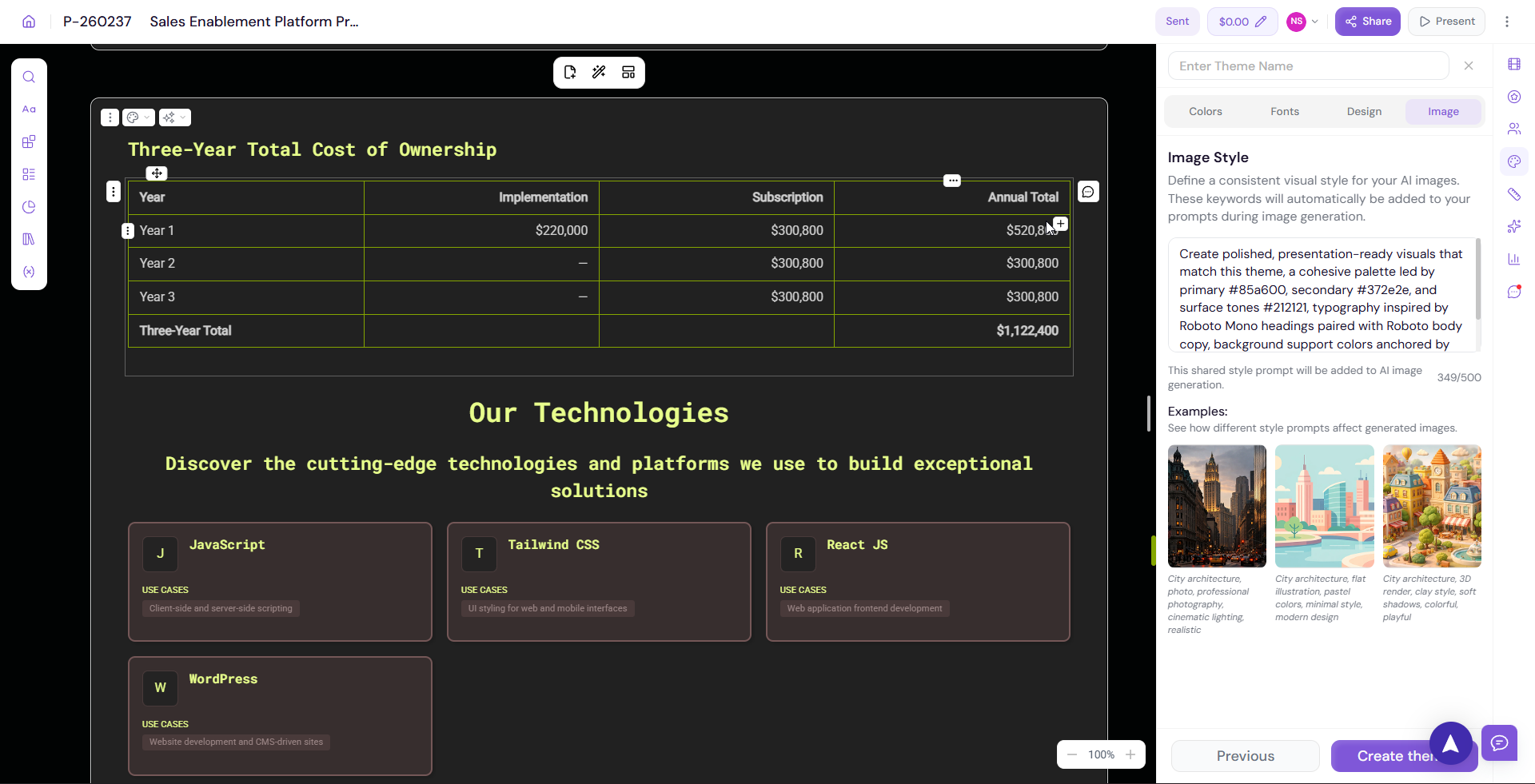
Images
Customize how images are displayed across your document.
Click on Images in the Themes panel
-
Adjust image display settings including:
Border radius
Shadow
Image fit and alignment
-
Preview the changes on the canvas in real time
Page Background
Customize the background of your document pages. You can choose from solid colours, patterns, or custom images.
Click on Page Background in the Themes panel
-
Choose your background type:
Solid colour — Select a single background colour
Pattern — Choose from available background patterns
Image — Upload or select a background image
-
Preview the changes on the canvas in real time
💡 Pro Tip Keep your page background clean and subtle. A solid white or light background works best for most professional documents. Save bolder backgrounds for presentations or webpages where visual impact matters more.
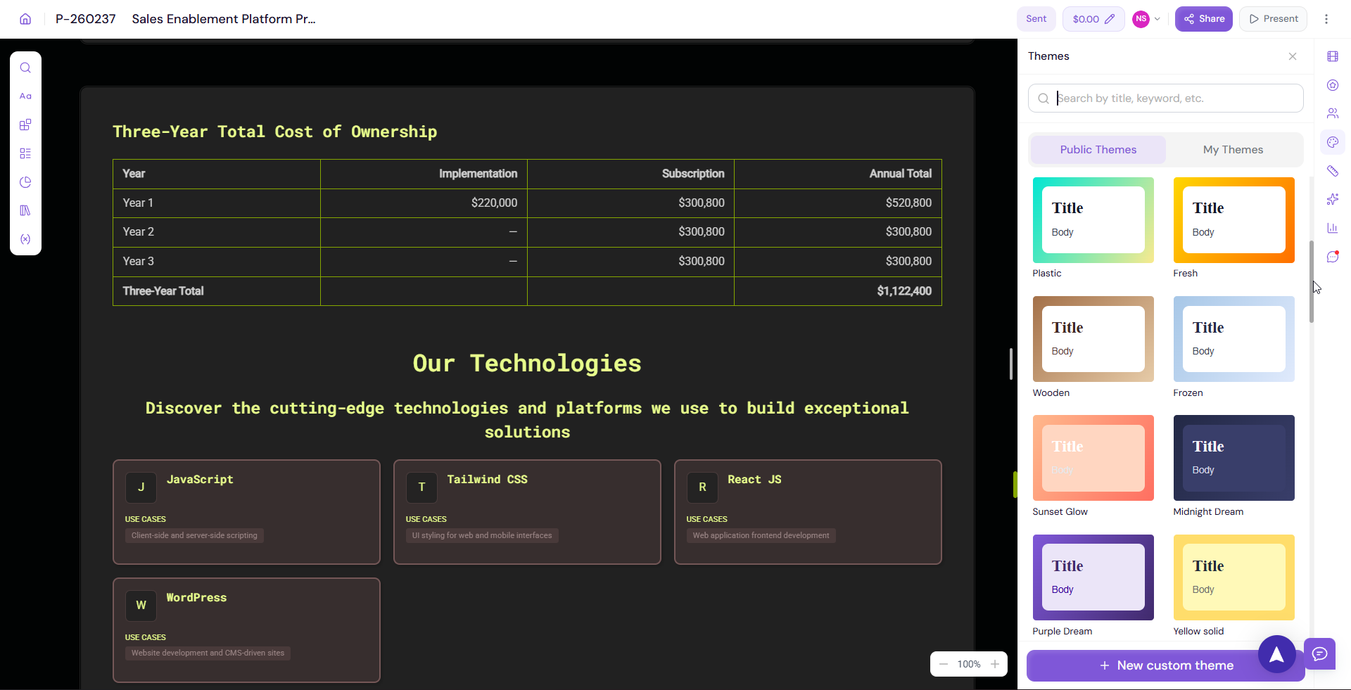
Switching Between Themes
Proposal.biz offers several pre-built themes you can switch between:
Org Theme — Your brand theme based on the branding extracted during onboarding
Lavender Biz
Majestic Violet
Black & White
To switch themes:
Open the Themes panel
Browse the available theme options
-
Click on any theme to apply it to your document instantly
💡 Pro Tip Start with your Org Theme as the base and make small adjustments from there. This ensures your document stays on-brand while giving you flexibility to customize for specific audiences or use cases.
Next Steps Learn how to share and send your finished document in Sharing and Sending Your Document.